Learn how to describe graphs and charts for SSC and HSC English 1st paper: the four-part format, useful data language, the tense rule, and full sample answers for pie charts, bar graphs, and line graphs, with practice charts.
In the exam, you are shown a chart, a circle cut into coloured slices, or bars of different heights, or a line rising and falling, and asked to describe it in about 150 words. Many students freeze at this point, wondering how on earth to turn a picture full of numbers into sentences.
But here is the secret that makes it easy: every chart description follows the same simple four-part shape, and once you learn a small handful of data words, you can describe almost any graph they put in front of you. In this lesson: Describing Graphs and Charts, I will give you the format, the language, and full sample answers for pie charts, bar graphs, and line graphs.
পরীক্ষায় তোমাকে কখনো একটি chart, কখনো রঙিন অংশে ভাগ করা একটি pie chart, কখনো বিভিন্ন উচ্চতার bar graph, আবার কখনো ওঠানামা করা একটি line graph দেওয়া হয় এবং প্রায় ১৫০ শব্দে সেটি বর্ণনা করতে বলা হয়। অনেক শিক্ষার্থী তখনই চিন্তায় পড়ে যায়, এতগুলো সংখ্যা আর তথ্যকে কীভাবে sentence-এ রূপ দেবে!
কিন্তু বিষয়টি আসলে অনেক সহজ। প্রায় সব chart description একই চারটি ধাপ অনুসরণ করে লেখা যায়। আর data বর্ণনার জন্য অল্প কিছু গুরুত্বপূর্ণ word ও phrase শিখে নিলে সামনে যে ধরনের graph-ই আসুক, তুমি সহজেই সেটি লিখতে পারবে।
এই পাঠে আমি তোমাকে chart description-এর সঠিক format, দরকারি language এবং pie chart, bar graph ও line graph-এর সম্পূর্ণ sample answer দেখাব।
What is Describing Graphs and Charts?
In SSC and HSC English 1st paper, this is Question 10, headed “Describe the chart in about 150 words. You should highlight and summarise the information given in the chart.” You are given a pie chart, a bar graph, or a line graph, and you must describe it in your own words in roughly 150 words. It carries ten marks. Your task is not to copy every number, but to describe the main information clearly and summarise it.
SSC ও HSC English 1st Paper-এ এটি Question 10 হিসেবে আসে। প্রশ্নের নির্দেশনা সাধারণত থাকে:
“Describe the chart in about 150 words. You should highlight and summarise the information given in the chart.”
এখানে একটি pie chart, bar graph বা line graph দেওয়া হয় এবং প্রায় ১৫০ শব্দে নিজের ভাষায় সেটি বর্ণনা করতে হয়। এই প্রশ্নে মোট ১০ নম্বর থাকে। তোমার কাজ প্রতিটি number হুবহু লিখে যাওয়া নয়। বরং chart-এর প্রধান তথ্যগুলো পরিষ্কারভাবে তুলে ধরতে হবে এবং শেষে সেগুলোর সারসংক্ষেপ দিতে হবে।
The Three Types of Graphs and Charts
First, learn to recognise which type of chart you have, because each type tells a different kind of story.
প্রথমে chart-এর ধরন চিনতে শেখো, কারণ প্রতিটি chart ভিন্ন ধরনের তথ্য প্রকাশ করে।
| Chart type | What it shows | Bengali |
|---|---|---|
| Pie chart (বৃত্তচিত্র) | the share of each part in a whole (percentages) | পুরোর মধ্যে প্রতিটা অংশের ভাগ |
| Bar graph (দণ্ডচিত্র) | a comparison between different categories | বিভিন্ন শ্রেণির তুলনা |
| Line graph (রেখাচিত্র) | a change or trend over time | সময়ের সাথে পরিবর্তন |
The 4-Part Format: Chart Description-এর চারটি ধাপ
Every chart description, whatever the type, follows these four parts in order. This is your reliable shape.
Chart যে ধরনেরই হোক না কেন, সাধারণত এই চারটি অংশ অনুসরণ করে লিখবে।
Rule 1: The Introduction (Say What the Chart Shows)
Start with one sentence that tells the reader what the chart is about. The easiest way is to rephrase the question in your own words. Use a verb like ‘shows’, ‘presents’, or ‘illustrates’. This single opening sentence orients the reader before any numbers appear.
Introduction, Chart কী দেখায় তা বলো
শুরুতে একটি sentence-এ chart-টি কী নিয়ে তা জানাও। সবচেয়ে সহজ উপায় হলো প্রশ্নের কথাটি নিজের ভাষায় পুনরায় লেখা।এখানে ‘shows’, ‘presents’ বা ‘illustrates’-এর মতো verb ব্যবহার করতে পারো। এই একটি opening sentence পাঠককে chart-এর বিষয় সম্পর্কে পরিষ্কার ধারণা দেয়।
Example:
- The pie chart shows how a middle-class family spends its monthly income on different items.
Rule 2: The Overview (The Main Point at a Glance)
After the introduction, give a one-sentence overview of the biggest picture, the main trend or the largest and smallest values. Begin with ‘At a glance’ or ‘In general’. This tells the reader the most important message before you go into the details.
Overview, মূল চিত্রটি এক নজরে বলো
Introduction-এর পরে একটি sentence-এ chart-এর সবচেয়ে গুরুত্বপূর্ণ দিকটি তুলে ধরো। এটি হতে পারে প্রধান trend, সবচেয়ে বড় value অথবা সবচেয়ে ছোট value। ‘At a glance’ বা ‘In general’ দিয়ে এই অংশ শুরু করতে পারো। Details-এ যাওয়ার আগেই এতে পাঠক chart-এর মূল তথ্যটি বুঝতে পারে।
Example:
- At a glance, we see that the largest part of the money goes on food, while the smallest goes on medical costs.
Rule 3: The Body (Describe the Details with Figures)
Now describe the data point by point, using the figures from the chart. For a pie chart, go from the biggest slice to the smallest. For a bar graph, compare the tallest and shortest bars. For a line graph, follow the trend over time, rises and falls. Join your points with linking words. This is the longest part, about three or four sentences.
Body, Figure ব্যবহার করে Details বর্ণনা করো
এবার chart-এর data একে একে বর্ণনা করো। Pie chart হলে সাধারণত সবচেয়ে বড় অংশ থেকে ছোট অংশের দিকে যাও। Bar graph হলে সবচেয়ে উঁচু ও নিচু bar তুলনা করো। Line graph হলে সময়ের সঙ্গে data কীভাবে বেড়েছে বা কমেছে তা অনুসরণ করো। Point-গুলোর মধ্যে সংযোগ তৈরি করতে linking word ব্যবহার করো। সাধারণত এই অংশটি সবচেয়ে বড় হয় এবং তিন বা চারটি sentence লেখা যায়।
Example:
- According to the chart, food takes the biggest share at 30%. The second largest expense is house rent at 20%, followed by education at 18%.
Rule 4: The Conclusion (One Summary Sentence)
Finish with a single sentence that sums up the whole chart. Begin with ‘In conclusion’ or ‘Overall’. Do not add new figures here; just state the main message one last time. This closing line is what the word ‘summarise’ in the question is asking for.
Conclusion, একটি Summary Sentence লেখো
সবশেষে একটি sentence-এ পুরো chart-এর মূল তথ্যটি সংক্ষেপে তুলে ধরো। ‘In conclusion’ বা ‘Overall’ দিয়ে শুরু করতে পারো। এখানে নতুন কোনো figure যোগ করবে না। শুধু chart-এর প্রধান message-টি আরেকবার সংক্ষেপে বলবে। Question-এ থাকা ‘summarise’ শব্দটির মূল উদ্দেশ্য এখানেই।
Example:
- In conclusion, the chart makes it clear that food is the heaviest burden on a family’s monthly budget.
Useful Language for Describing Data
Keep these words ready. They are the tools that turn numbers into good sentences.
Data বর্ণনার জন্য Useful Language: এই word ও phrase-গুলো মনে রাখো। Number-কে স্বাভাবিক sentence-এ রূপ দিতে এগুলো খুব কাজে আসে।
| Use | Words | Bengali |
|---|---|---|
| To open | shows, presents, illustrates, represents | দেখায় |
| Going up (line) | increases, rises, goes up, grows, climbs | বাড়ে |
| Going down (line) | decreases, falls, drops, declines, goes down | কমে |
| No change | remains stable, levels off, stays the same | স্থির থাকে |
| Up and down | fluctuates | ওঠানামা করে |
| Degree of change | sharply, rapidly, steadily, gradually, slightly | তীব্রভাবে, ধীরে, ক্রমান্বয়ে, সামান্য |
| Comparison | the highest, the lowest, more than, less than, twice as much as | সর্বোচ্চ, সর্বনিম্ন, বেশি, কম |
The Tense Rule
Choose your tense by the time of the data. If the chart shows present facts, such as how a family spends its income now, use the simple present (shows, takes, spends). If the chart shows past data, such as pass rates from 2019 to 2023, use the simple past (was, rose, fell). Our lessons on tenses and right forms of verbs help you keep this right.
Chart-এর data কোন সময়ের তা দেখে tense নির্ধারণ করবে। যদি chart বর্তমানের কোনো তথ্য দেখায়, যেমন একটি পরিবার বর্তমানে কীভাবে income খরচ করে, তাহলে simple present ব্যবহার করবে, যেমন shows, takes, spends।
আর chart যদি অতীতের data দেখায়, যেমন 2019 থেকে 2023 সালের pass rate, তাহলে simple past ব্যবহার করবে, যেমন was, rose, fell। Tense আরও ভালোভাবে বুঝতে আমাদের Tenses এবং Right Forms of Verbs বিষয়ক পাঠগুলো পড়তে পারো।
Sample Answer 1: Pie Chart
Question: Look at the following pie-chart. The pie chart shows how a middle-class family spends its monthly income. (Food 30%, House rent 20%, Education 18%, Clothing 12%, Medical 10%, Others 10%.)
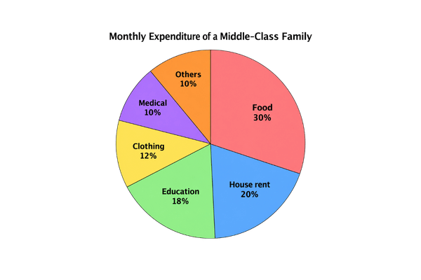
Answer: The pie chart shows how a middle-class family in Bangladesh spends its monthly income on different items. At a glance, we see that the largest part of the money goes on food. According to the chart, food takes up the biggest share, 30% of the total income. The second largest expense is house rent, which is 20%. Education comes next, taking 18% of the income, which shows that the family values learning. The family spends 12% on clothing and 10% on medical costs. The remaining 10% goes on other items such as transport and entertainment. Thus, most of the money is spent on the basic needs of food, rent, and education, while the smallest amounts go to clothing and medical care. In conclusion, the chart makes it clear that food is the heaviest burden on a family’s monthly budget.
Sample Answer 2: Bar Graph
Question: Look at the following bar graph. The bar graph shows the choice of reading books among students in a school library. (Story books 65%, Science books 60%, Journals 40%, Poems 38%, History 35%.)
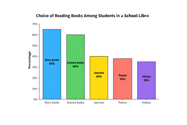
Answer: The bar graph shows the choice of reading books among the students of a school library. At a glance, story books are the most popular, while history books are the least read. According to the graph, the highest number of students, 65%, like to read story books. Science books come a close second, chosen by 60% of the students. After that, there is a clear drop, as only 40% of the students read journals. Poems are read by 38% of them, and history books attract the fewest readers, just 35%. So we can see that the students prefer story and science books far more than journals, poems, and history books. In conclusion, the graph shows that light and interesting books like stories and science are much more popular among students than serious subjects such as history.
Sample Answer 3: Line Graph
Question: Look at the following line graph. The line graph shows the pass rate of a school in the SSC examination from 2019 to 2023. (2019: 60%, 2020: 68%, 2021: 75%, 2022: 72%, 2023: 90%.)
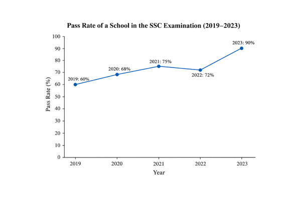
Answer: The line graph shows the pass rate of a school in the SSC examination from 2019 to 2023. In general, the graph shows a rising trend in the pass rate over these five years, in spite of a small fall in one year. In 2019, the pass rate was 60%, the lowest in the whole period. After that, it rose steadily to 68% in 2020 and then climbed to 75% in 2021. In 2022, however, the rate fell slightly to 72%. The most remarkable rise came in the final year, when in 2023 the pass rate jumped sharply to 90%, the highest point on the graph. Thus, apart from the small dip in 2022, the school’s results improved year after year. In conclusion, the graph clearly shows that the school’s SSC pass rate has improved greatly over these five years.
Notice that Sample 3 uses the past tense, because the data belongs to past years, while Samples 1 and 2 use the present tense for present facts.
খেয়াল করো, Sample 3-এ past tense ব্যবহার করা হয়েছে, কারণ data অতীতের কয়েকটি বছরের। অন্যদিকে Sample 1 ও Sample 2-এ বর্তমানের সাধারণ তথ্য বোঝানো হয়েছে, তাই present tense ব্যবহার করা হয়েছে।
Common Mistakes to Avoid
- Do not just copy every single number without any sentences around them. The examiner wants a description, not a list. Turn the figures into full sentences with comparison words like ‘the highest’, ‘more than’, and ‘the least’.
- Do not forget the overview and the conclusion. Many students write only the middle details and skip the one-line overview at the start and the summary at the end. The question’s word ‘summarise’ means these two sentences are essential.
- Do not use the wrong tense. Check whether the data is about the present or the past, and keep your verbs to match. A pie chart of present habits takes the present tense; a graph of past years takes the past tense.
- Do not add your own opinion or information from outside the chart. Describe only what the chart shows. This is a description, so keep to the data given and leave your personal views out.
যেসব সাধারণ ভুল এড়িয়ে চলবে
- শুধু একটির পর একটি number লিখে যেয়ো না। Examiner একটি description চায়, number-এর তালিকা নয়। Figure-গুলোকে ‘the highest’, ‘more than’, ‘the least’-এর মতো comparison word ব্যবহার করে পূর্ণ sentence-এ প্রকাশ করো।
- Overview এবং conclusion বাদ দিও না। অনেক শিক্ষার্থী শুধু মাঝের details লেখে, কিন্তু শুরুতে one-line overview এবং শেষে summary দেয় না। Question-এ ‘summarise’ বলা হয়েছে, তাই এই দুটি অংশ গুরুত্বপূর্ণ।
- ভুল tense ব্যবহার কোরো না। Data বর্তমানের নাকি অতীতের, আগে সেটি দেখো। বর্তমানের অভ্যাস বা তথ্য নিয়ে pie chart হলে present tense ব্যবহার করবে। অতীতের বছরভিত্তিক graph হলে past tense ব্যবহার করবে।
- Chart-এর বাইরে নিজের মতামত বা অতিরিক্ত তথ্য যোগ কোরো না। Chart-এ যা দেখানো হয়েছে, শুধু সেটিই বর্ণনা করো। এটি data description, তাই নিজের ব্যক্তিগত opinion এখানে যোগ করার প্রয়োজন নেই।
Practice Exercise
Describe each chart below in about 150 words, following the four-part format. A model answer is given for the first one.
নিচের প্রতিটি chart প্রায় ১৫০ শব্দে বর্ণনা করো। উপরের চারটি ধাপ অনুসরণ করবে। প্রথম chart-এর জন্য একটি model answer দেওয়া হলো।
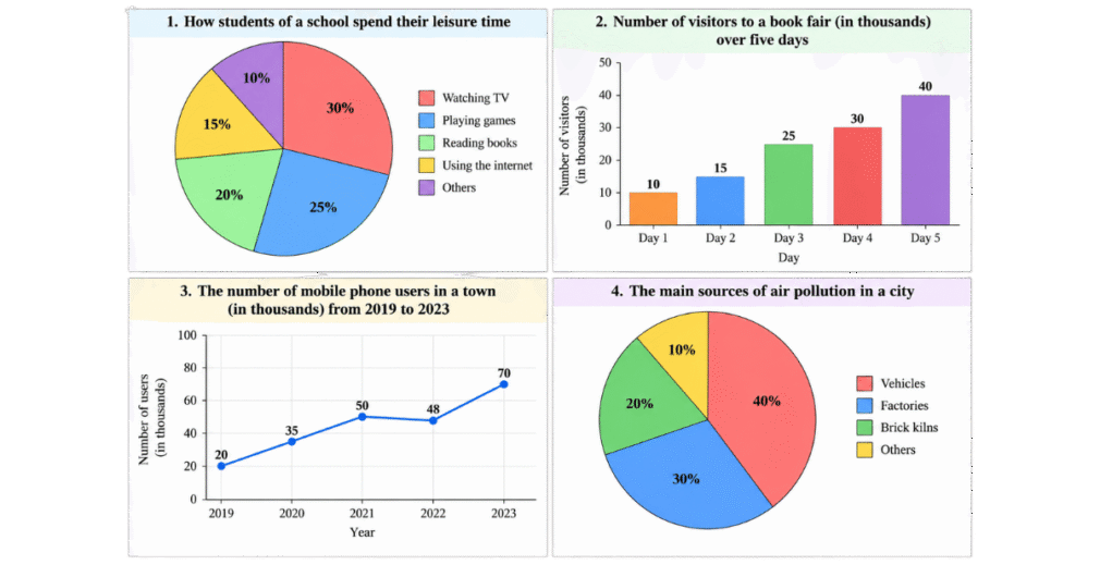
- Pie chart — How students of a school spend their leisure time: Watching TV 30%, Playing games 25%, Reading books 20%, Using the internet 15%, Others 10%.
- Bar graph — Number of visitors to a book fair (in thousands) over five days: Day 1: 10, Day 2: 15, Day 3: 25, Day 4: 30, Day 5: 40.
- Line graph — The number of mobile phone users in a town (in thousands) from 2019 to 2023: 2019: 20, 2020: 35, 2021: 50, 2022: 48, 2023: 70.
- Pie chart — The main sources of air pollution in a city: Vehicles 40%, Factories 30%, Brick kilns 20%, Others 10%.
Model Answer for Chart 1
The pie chart shows how the students of a school spend their leisure time on different activities. At a glance, we see that watching television takes the largest share of their free time, while other small activities take the least. According to the chart, the students spend the most time, 30%, watching television. Playing games comes next, taking 25% of their leisure time. Reading books accounts for 20%, which is a healthy sign. The students spend 15% of their free time using the internet, and the remaining 10% goes on other activities. Thus, entertainment through television and games fills more than half of their leisure time, while reading and the internet take smaller shares. In conclusion, the chart shows that most students prefer watching television and playing games to reading books in their free time.
A Tip for the Exam
The secret to describing a chart is to follow the four-part shape every time: say what the chart shows, give the overview, describe the details with figures, and end with a summary. Learn the small set of data words, the highest, the lowest, rises, falls, steadily, sharply, and you can handle any chart.
First check whether the data is present or past to fix your tense. Keep your description to about 150 words, use full sentences instead of a bare list of numbers, and never forget the opening and closing sentences. Practise one pie, one bar, and one line graph each week, and this ten-mark question will become one of your safest.
Chart description ভালো করার সবচেয়ে সহজ উপায় হলো প্রতিবার একই চারটি ধাপ অনুসরণ করা।
প্রথমে chart কী দেখায় তা বলো। এরপর overview দাও। তারপর figure ব্যবহার করে details বর্ণনা করো। সবশেষে একটি summary দিয়ে শেষ করো। ‘the highest’, ‘the lowest’, ‘rises’, ‘falls’, ‘steadily’, ‘sharply’-এর মতো কয়েকটি data word ভালোভাবে শিখে রাখলে প্রায় যেকোনো chart সহজে বর্ণনা করতে পারবে।
লেখা শুরু করার আগে data বর্তমানের নাকি অতীতের তা দেখে tense ঠিক করো। প্রায় ১৫০ শব্দে পূর্ণ sentence ব্যবহার করে লিখবে, শুধু number-এর তালিকা দেবে না। আর opening ও closing sentence কখনো বাদ দিও না।
প্রতি সপ্তাহে একটি pie chart, একটি bar graph এবং একটি line graph অনুশীলন করো। তাহলে এই ১০ নম্বরের প্রশ্নটি পরীক্ষায় তোমার জন্য সবচেয়ে নির্ভরযোগ্য নম্বর পাওয়ার অংশগুলোর একটিতে পরিণত হবে।
Related Lessons
Keep improving your writing with these lessons:
- Summary Writing: How to Write a Summary of a Passage
- Sentence Connectors and Linkers: Full List, Rules & Examples
- Theme Writing for HSC English 1st Paper: Rules & Sample Themes
- Paragraph Writing: Shortcut Method for Board Exams
- Notice Writing: Format, Rules & Sample Notices for Exams
- Essay Writing in English: Structure, Rules & Sample Essay
- Right Forms of Verbs: All Rules, Examples & Exercises
- 12 Tenses in English Grammar: Full Classification
- Completing Story: Rules & Sample Stories for SSC and HSC
- Report Writing for HSC: Newspaper & Event Report Format with Samples
- Poster and Slogan Writing: Format, Rules & Examples
Frequently Asked Questions
How do I describe a graph or chart in the exam?
Follow a four-part format: an introduction that says what the chart shows, an overview of the main point, a body that describes the details with figures, and a one-sentence conclusion that summarises the chart. Write about 150 words.
What tense should I use to describe a chart?
Use the simple present for present facts, such as how a family spends its income now, and the simple past for past data, such as pass rates from 2019 to 2023. Match the tense to the time of the data.
What is the difference between a pie chart, a bar graph, and a line graph?
A pie chart shows the share of each part in a whole, using percentages. A bar graph compares different categories. A line graph shows a change or trend over time.
Do I need a conclusion when describing a chart?
Yes. End with a single summary sentence beginning with ‘In conclusion’ or ‘Overall’. The word ‘summarise’ in the question asks for this closing line, and many students lose marks by skipping it.
How many words should the description be?
About 150 words is expected for the SSC and HSC question. Write full sentences using comparison and trend words, not just a list of numbers, and cover the main information rather than every tiny figure.